Proofread Before You Ink
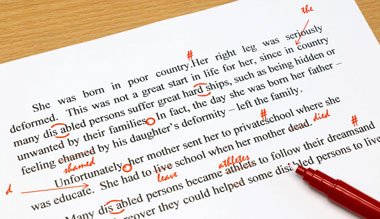
Word tattoos are among the most popular designs today, especially in delicate fine line script along the forearm, collarbone, or ribs. They’re also the tattoos most likely to go viral for the wrong reasons. A misplaced apostrophe or a misspelled word is easy to fix on paper and very hard to fix on skin. Before you commit, run your phrase through this checklist.
1. Its vs. it’s
It’s means “it is” or “it has.” Its is possessive. “It’s okay” and “Every storm runs out of rain, its time will pass” are both correct, but swap them and the tattoo is wrong forever.
2. Your vs. you’re
“You’re my sunshine” (you are). “Your light” (belonging to you). This is the single most common error in quote tattoos.
3. Then vs. than
“Stronger than yesterday” compares. “First breathe, then begin” refers to time. Read your phrase aloud to hear which one fits.
4. Lose vs. loose
“Never lose hope” is the motto; “never loose hope” is a typo. One letter, very different meaning.
5. Apostrophes in names and plurals
Plurals don’t take apostrophes (“the Smiths,” not “the Smith’s”). Possessives do (“Mom’s garden”). Names ending in s, such as “James’s” versus “James’,” are a style choice; pick one and be consistent.
6. Foreign phrases
Latin, French, Italian and Japanese phrases are popular, and online translators get them wrong all the time. Grammatical gender, word order, and accents all matter. Ask a fluent speaker to check your phrase, and ideally ask for the exact spelling with accents in writing.
7. Capitalization and punctuation as design choices
All-lowercase script can look elegant and intentional; random capitals can look like mistakes. Decide whether your quote ends with punctuation, and make sure quotation marks and commas are placed correctly if you include them.
8. Dates and numerals
Roman numerals are a classic choice for birthdays and anniversaries. Double-check the conversion (2019 is MMXIX, not MMIXX) and agree on the format with your artist: dots, dashes, or spaces.
Why fine line script needs extra care
Fine line lettering uses very thin needles, which create crisp, delicate words that suit short quotes and names. That delicacy also means letters can soften and spread slightly as the skin ages, especially when the text is very small or the letters sit close together. A few practical tips:
- Go a little bigger than you think. Lowercase letters need room for the loops of e, a and o to stay open.
- Choose a font with clear spacing between letters.
- Avoid high-friction spots like fingers and the sides of hands for long text.
- Follow aftercare closely and wear sunscreen once healed. Sun is the biggest enemy of thin lines.
For a deeper look at the style itself, including placement ideas and what to expect over the years, this guide covers how fine line tattoos heal and age.
A final proofreading routine
- Type your phrase and read it aloud, slowly.
- Have two other people read it without telling them what it should say.
- Check every word in a dictionary, including words you’re sure about.
- Approve the stencil letter by letter before the artist starts. Stencils are drawn in reverse and errors can slip in.
Words carry meaning, and on skin they carry it for a lifetime. A few extra minutes of proofreading guarantees that the only thing people notice about your tattoo is how beautiful it is.
About the Author